Chicken or beef - Food social media app
UI DESIGN | CHICKEN OR BEEF — CLIENT PROJECT BY XCCELERATE
As a UI/UX Designer, I researched similar platforms that utilized the same functionality, feel and look, as well as producing an aesthetically pleasing UI that would enhance the overall user experience. To achieve this, I developed coherent and consistent design systems, and created and organized design components that could be easily implemented across the app. The main focus was to address client’s pain points on branding and implementing consistent guidelines for developers to follow. The end result was a visually appealing and user-friendly platform that met the client's specifications and expectations.
Furthermore, to meet client needs I used my background in graphic design and marketing to create a mini-brand guideline for the client to follow and to see how having a consistent branding could help with just not their UI but also how users would be able to identify them from other social media platforms.


RESEARCH & IDEATE
Firstly, Chicken or Beef (CoB) focuses on food related content to help users to users decide what to eat and find out the users taste/preferences. In order to understand the needs of the clients and what they’re currently in the process of improving helped me as a designer know what I could do for them as a designer. Thus, CoB really wanted a consistent brand to apply in all their screens. To add, creating a project timeline is important for all stakeholders to be accountable to the project deliverables.

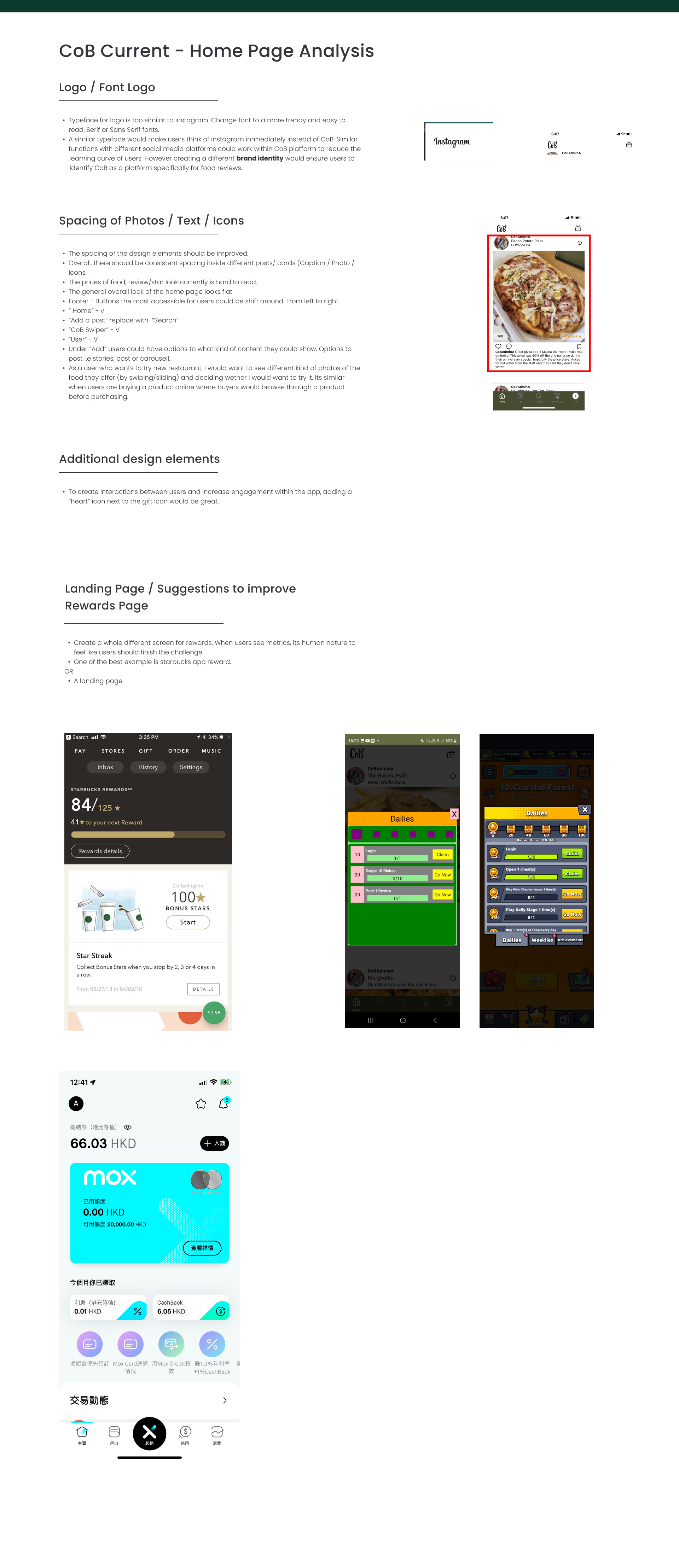
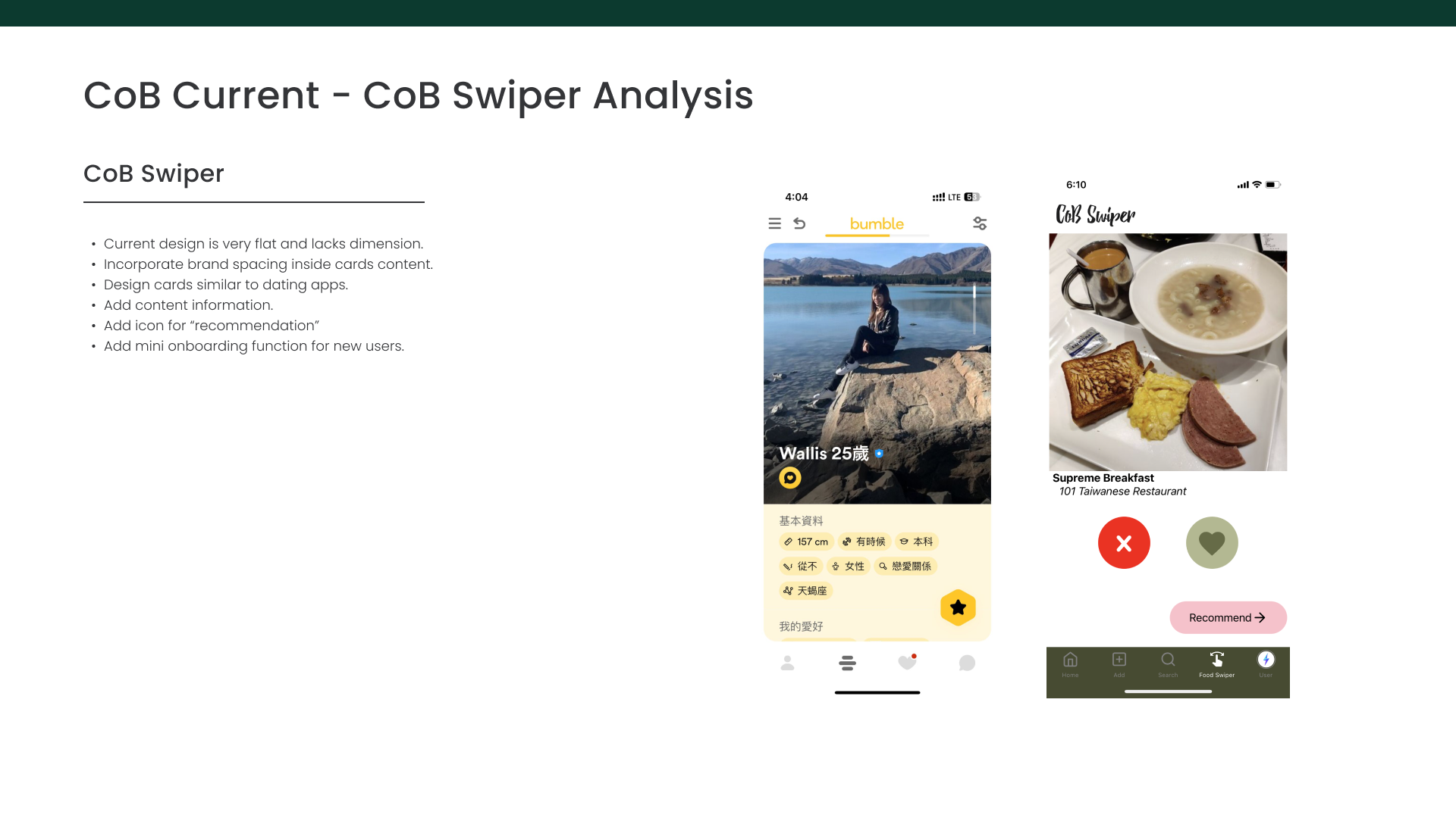
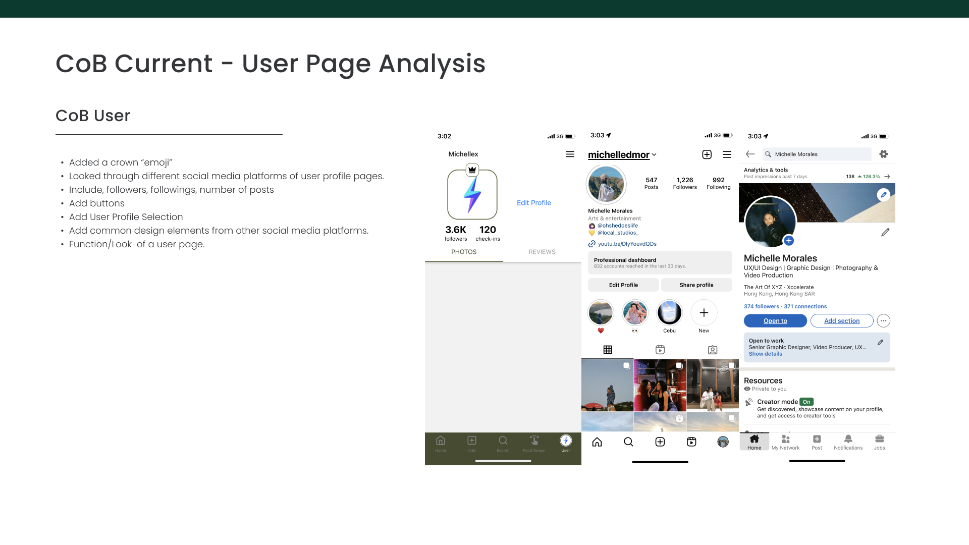
CoB Screen Analysis
After, researching similar apps and client references I note down featured that could be improved in their current User Interface Design and also recommend new features for users to be more engaged with CoB.
Screens to redesign:
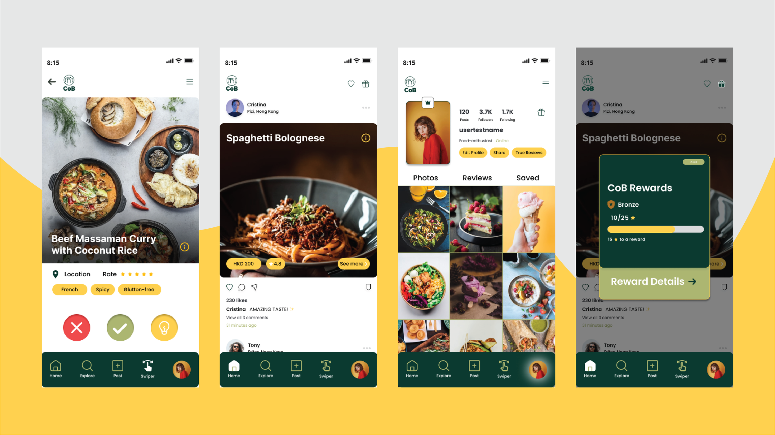
1. Home Page
2. Swiper Page
3. User Page
4. Rewards Landing Page
Low Fidelity Wireframe
From competitor research and finding out similar features from social media apps, I brainstormed different page layouts to help me design what would fit the clients needs.

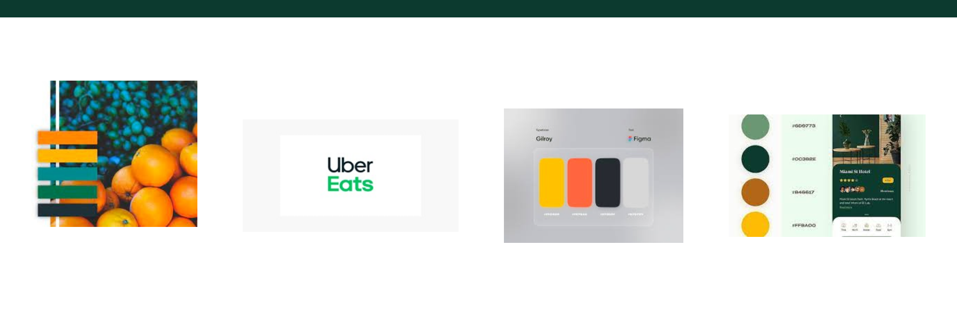
Design Systems / Design Components
Creating a mini brand for them was fun and it made me more keen on improving the pages. Having a consistent color brand, spacing and size for specific design components is important for brands to be consistent not only just in UI but also how they want to be seen as a brand.

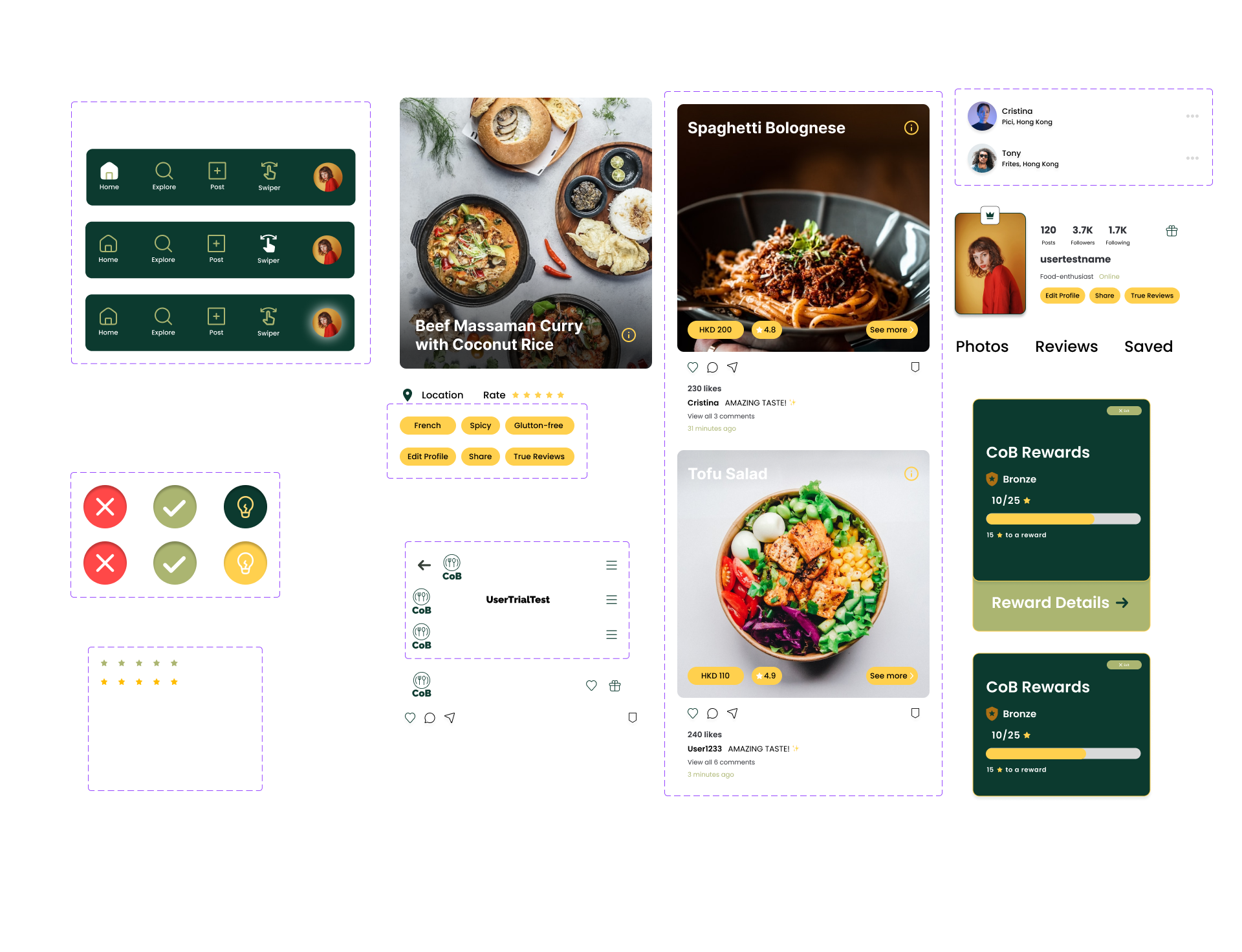
High Fidelity Wireframe
Narrowing down the layouts I have done in my notebook I then created the high fidelity wireframe to incorporate CoB’s branding. While creating features of the page I also realised that after adding on feedback from my mentor there would always be changes in the design.