
MOBBIN - DESIGN REFERENCE LIBRARY
UI DESIGN | MOBBIN — STUDENT PROJECT BY XCCELERATE
In order to practice my skills on Figma, we were assigned to redesign any websites of our choice. Since, I am re-learning my knowledge on UX/UI Design there have been a multiple companies that helps designers build designs systems in order for them to shorten their workflow and to also compile design trends for designers when finding design references.
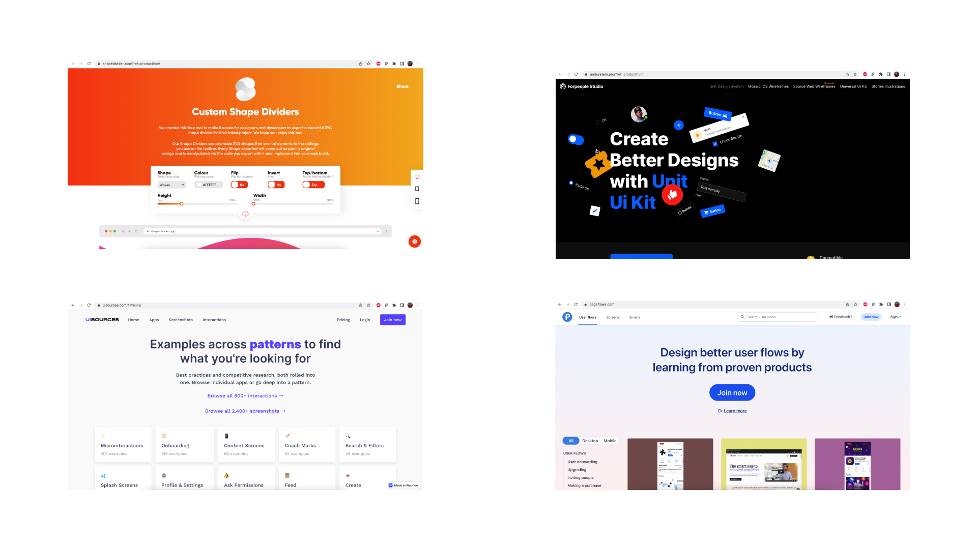
Mobbin was one of the websites that sells digital assets for designers to look through. When looking through the website I found that it’s hard to actually understand what kind of company they are.

RESEARCH
When looking through their competitors website, there are a few things that as a user makes me not want to use Mobbin as a took to look for screens.
Hero Banner Image looks too crowded / overwhelming
When Scrolling down the home page — users are required to immediately sign up to Mobbin. This function would be a turn off to users who are just browsing through to see what Mobbin could offer them in their regular work flow.
Branding is already too minimalistic.
To improve:
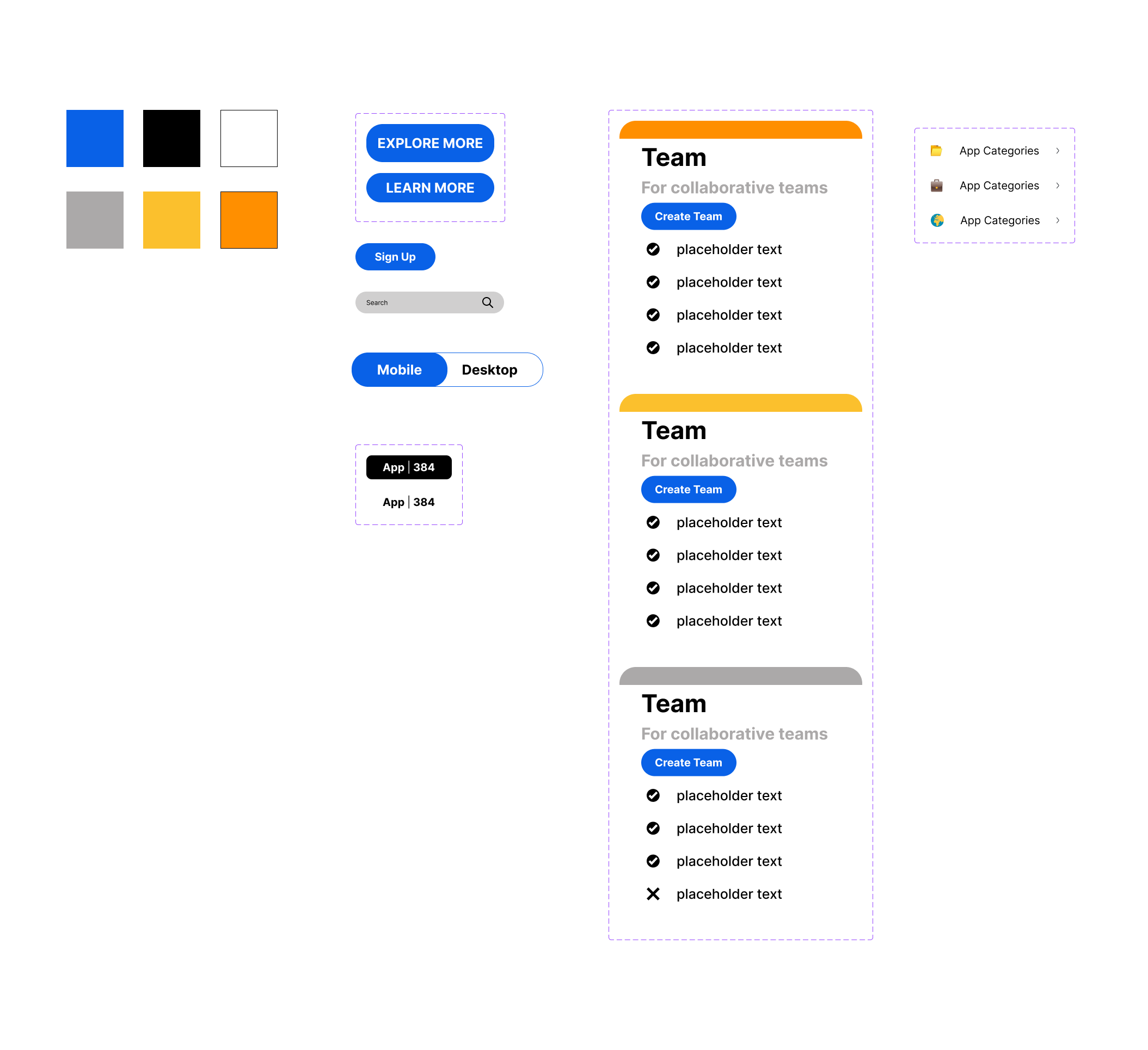
Get users to be more immersed by letting them explore the website.
Use Icons and cards for “Log-ins/ Sign-Ups” more obvious.
Add more personal touches i.e emojis to make it more fun.
Give a taste of what Mobbin could offer to users instead of forcing them to sign up.
BUILD DESIGN COMPONENTS
This is my first time building design systems and familiarising myself with Figma was interesting. However, when I understood the logic of how framing, grouping and the use of auto-layout when building design components made me realise that its very similar to when graphic designers needs to create brand guidelines for clients. In the end, I find it really fun building and organising the components to make it easier along the way.
HIGH FIDELITY WIREFRAME
Not gonna lie I have done multiple iterations of wireframe for this design. It also made me realise that there are still aspects where there should be more information or think of the how the user journey would be like.
